
UX/UI
Domain Kiosk
Way-finding for the Domain
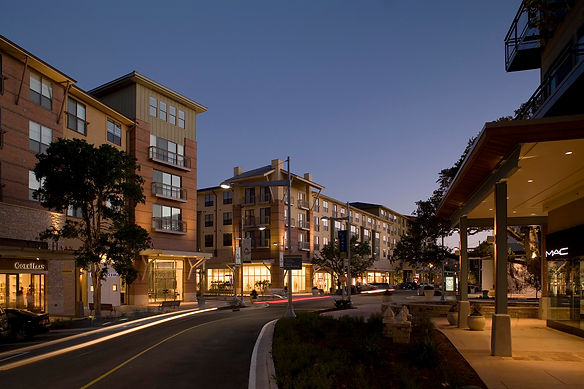
The Domain is a highly popular lifestyle center in North Austin that attracts many people looking for an attractive and fun shopping and dining experience. With so many options for parking, lodging, shopping, and dining, wayfinding can be challenging and frustrating which negatively affects the customer experience.
Problem
The Domain development covers over 300 acres and consists of 137 stores and retail services occupying over 1.2 million square feet. It has become one of the top retail shopping, dining, and residential developments in the nation and has a very attractive village-like atmosphere. Unfortunately, with it’s size and the population it attracts, navigation and wayfinding throughout The Domain can become quite challenging and diminish the positive customer experience it seeks to provide.
Execution
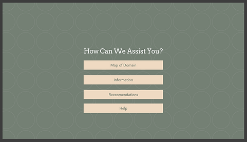
What indoor malls were to the 1980’s and 1990’s, outdoor lifestyle centers are to the twenty-first century. The Domain is a mall on steroids so I wanted to take an element of mall wayfinding and advance it into the twenty-first century as well. I started with the notion of the “mall directory” and created an outdoor, walk-up kiosk with interactive functionality. With the touch of a finger, customers can search by categories or specific retail locations. The kiosk will then provide the most efficient route to that location from the current location, the closest parking facility with available spaces, and current wait times if the search is a restaurant. The intent is to continue expanding the kiosk capability to be compatible with a smart phone app and other wayfinding technologies.

Research
The most important piece of information I wanted to know from those I interviewed was what frustrates them the most about the Domain? In order to create a successful way-finding kiosk, I needed to understand the different experiences from many people at the Domain and what they were attempting to do there.
Personas
Talking to people who were and were not familiar with the Domain really helped me to get a better understanding of all the pros and cons it holds when it comes to navigating this area.

Feature Prioritization
This chart helped me to incorporate the most useful data in order to make the app successful.

Prototypes and User Feedback
User testing on low-fidelity prototypes helped me identify the UI design issues before moving on to high fidelity prototypes. I made the updates to my design and other minor changes based on peer feedback.


Identity

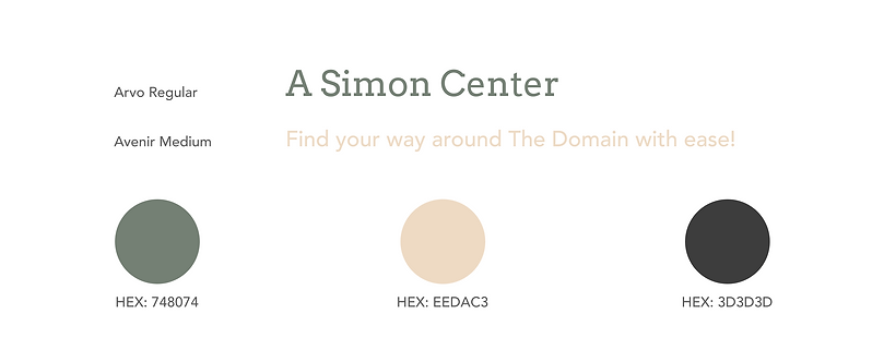
Typography & Color Palette
Design System

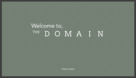
Onboarding
Welcome screen and intro screen to start the wayfinding process.
Map


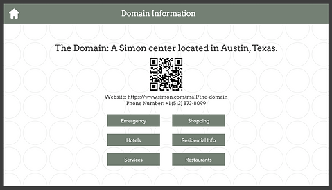
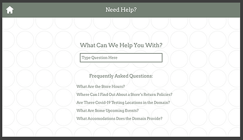
Informational Screens

Mockups

